 HTML · CSS
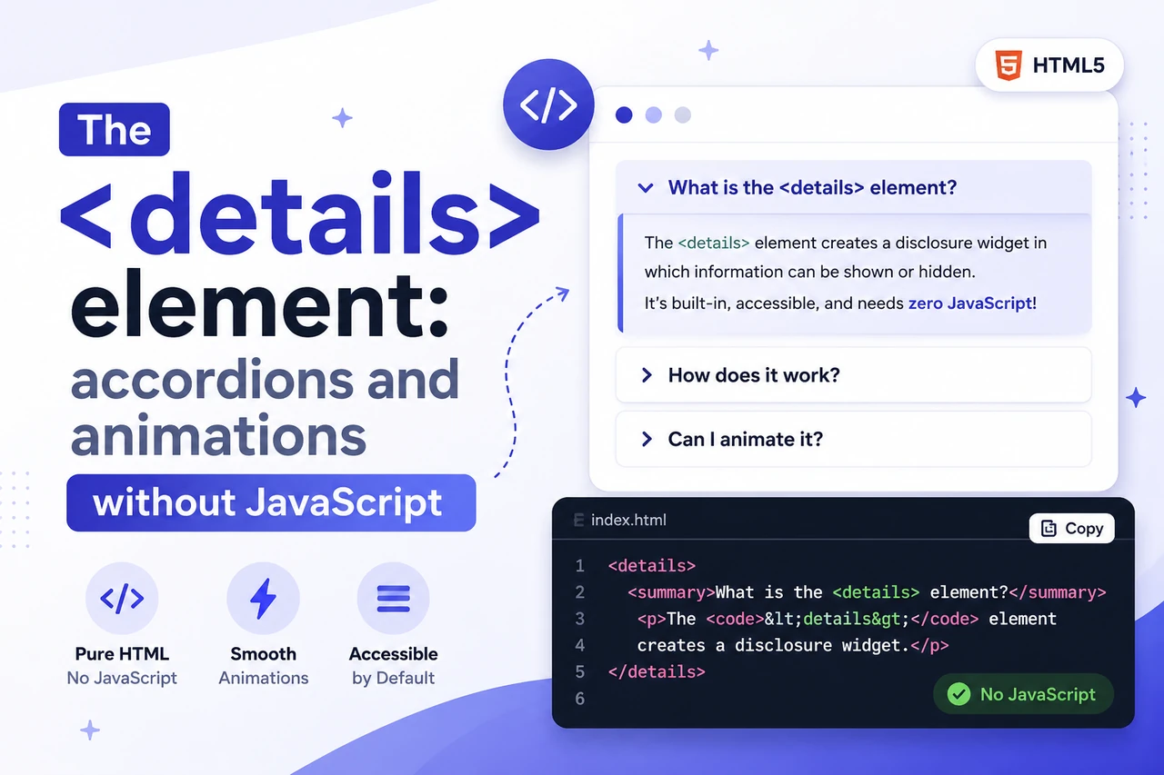
The <details> element: accordions and animations without JavaScript
You've probably used the <details> element for a simple FAQ box. But it can do a lot more — exclusive accordion groups, deep-linkable answers, and smooth open/close animations. All of it in plain HTML and CSS, with zero scripts.
The <details> element is the closest thing HTML has to free interaction. One tag, a click, and content expands — no JavaScript, no event listeners, no state to track. Most people stop right there. But the browser ships a surprising amount of hidden power under that little triangle: groups that close each other, panels that open from a URL hash, and animations that make it feel like you wrote a script when you didn't.
- The
nameattribute groups<details>elements into an exclusive accordion — opening one closes the others, with zero JavaScript. - An
idon the panel turns every answer into a deep link:#answer-3in the URL opens it automatically. ::details-contentplusinterpolate-size: allow-keywordsgives smooth JS-free open and close animations.
1. The basics: summary and open
A <details> element is a disclosure widget. The label lives in
<summary>, and everything after it is the collapsible content.
That's the whole contract.
<details>
  <summary>System requirements</summary>
  <p>Any computer with a browser. That's about it.</p>
</details>
Click it and the content appears. The browser handles the click, the keyboard, and the
state — no onclick, no aria-expanded, no class toggling.
If you want a panel pinned open from the start, add the open attribute:
<details open>
  <summary>Shipping</summary>
  <p>Free over $50, two days anywhere.</p>
</details>
The open attribute is also how you control state from elsewhere. Add it,
remove it, read it — it's a normal attribute, and the whole behavior follows from it.
2. The name attribute: a real accordion
Here's the part almost nobody knows. Give two <details> elements the
same name and they become a group — like radio buttons. Open one, and the
browser closes whichever other member was open.
<details name="faq">
  <summary>What payment methods do you accept?</summary>
  <p>Cards, PayPal, and bank transfer.</p>
</details>

<details name="faq">
  <summary>How long does shipping take?</summary>
  <p>3–5 business days.</p>
</details>

<details name="faq">
  <summary>Can I return an item?</summary>
  <p>Yes — 30 days, no questions asked.</p>
</details>
Three boxes, one name, real accordion behavior. No script tracked which
panel was open, because there is no script. You can run several groups on one page —
just use a different name per group — and the panels don't even need to sit next to
each other. The name groups them, not their position in the document.
Browser support is solid: Chrome 120+, Firefox 125+, Safari 17.4+. Older browsers simply ignore the attribute, and your accordion quietly becomes a set of independent boxes. That's a perfectly safe fallback, not a bug.
Cards, PayPal, and bank transfer.
3. Deep-linking: every answer gets its own URL
Give a <details> element an id and the browser opens it
automatically when the URL contains that hash. This is my favorite trick in this whole
post, and it costs one attribute.
<details id="answer-returns">
  <summary>Can I return an item?</summary>
  <p>Yes — 30 days, no questions asked.</p>
</details>

<a href="#answer-returns">Jump to the returns answer</a>
Open the page with #answer-returns at the end of the URL and that panel
starts expanded. On a long FAQ page, that turns every question into its own
addressable answer — you can link to it from other pages, from an email, from a
support ticket. The browser scrolls to it and opens it. Nothing else to wire up.
4. Styling: swap the triangle, keep the markup
The little triangle is the ::marker, and you can restyle or remove it.
The battle-tested way to replace it with your own icon:
summary {
  list-style: none;              /* Chrome and Firefox */
}

summary::-webkit-details-marker {
  display: none;                 /* Safari */
}

summary::after {
  content: "+";
  margin-left: 6px;
  transition: transform 0.2s ease;
}

details[open] summary::after {
  transform: rotate(45deg);      /* + becomes x */
}
The details[open] selector is the state hook — style the summary, the
panel, or anything inside based on it. The newer :open pseudo-class does
the same thing; use whichever you find clearer.
And then there's ::details-content, which deserves its own section. It's
the pseudo-element that finally lets you style the expandable area directly — no
wrapper div inside your <details>, which was the old workaround.
5. Smooth animations, still zero JavaScript
The classic complaint about <details> was the snap. Click, and the
content just appears. That era is over. With ::details-content targetable
and interpolate-size: allow-keywords understood, the browser can animate
between a fixed height and auto:
/* enable intrinsic-size animation for the whole page */
:root {
  interpolate-size: allow-keywords;
}

/* the panel starts collapsed and glides open */
details::details-content {
  height: 0;
  overflow: clip;
  transition: height 0.4s ease, content-visibility 0.4s ease allow-discrete;
}

details[open]::details-content {
  height: auto;
}

/* respect reduced-motion preferences */
@media (prefers-reduced-motion: reduce) {
  details::details-content {
    transition: none;
  }
}
Three things are worth explaining here. First, height: 0 to
auto is only animatable because of
interpolate-size: allow-keywords — without it, the browser treats
auto as a non-animatable keyword and snaps. Second,
allow-discrete is required because content-visibility is a
discrete property; the keyword tells the browser to wait before swapping the hidden
state, which is what makes the closing animation work at all. Third, the
reduced-motion block matters: an accordion that snaps open is fine, a half-animated
one for someone who asked for no motion is not.
interpolate-size is Chrome and Firefox today; Safari gets a clean snap,
which is a perfectly acceptable fallback for a content reveal.
6. Gotchas worth knowing
| The gotcha | What to do |
|---|---|
Two open panels in one name group |
The browser keeps only the last one in document order — author your markup with a single open per group, on the answer most people need. |
Custom ::marker text in Safari |
Swapping the marker's content isn't universal yet — hide the default marker and draw your own icon instead. |
| Height animations cost layout | Smooth, but keep them for a handful of panels — a thousand-item list will pay for it in layout time. |
The toggle event |
<details> fires it on every open and close. It's the one sanctioned hook if you need JavaScript, for example to lazy-load heavy content. |
7. The full recipe
Here's everything in one runnable page. Open the
FastCompiler HTML code runner, paste the HTML into the
index.html tab, paste the styles into the styles.css tab,
and press Run.
<!DOCTYPE html>
<html lang="en">
<head>
  <meta charset="UTF-8">
  <meta name="viewport" content="width=device-width, initial-scale=1.0">
  <title>FAQ with a native accordion</title>
</head>
<body>
  <h1>Frequently asked questions</h1>

  <details name="faq" open id="answer-payments">
    <summary>What payment methods do you accept?</summary>
    <p>Cards, PayPal, and bank transfer.</p>
  </details>

  <details name="faq" id="answer-shipping">
    <summary>How long does shipping take?</summary>
    <p>3–5 business days.</p>
  </details>

  <details name="faq" id="answer-returns">
    <summary>Can I return an item?</summary>
    <p>Yes — 30 days, no questions asked.</p>
  </details>

  <p><a href="#answer-returns">Open the returns answer directly</a></p>
</body>
</html>summary {
list-style: none;
cursor: pointer;
padding: 12px 16px;
border: 1px solid #e5e7eb;
border-radius: 10px;
margin-bottom: 6px;
font-weight: 600;
}
summary::-webkit-details-marker {
display: none;
}
details[open] summary {
border-color: #c7d2fe;
}
details::details-content {
height: 0;
overflow: clip;
transition: height 0.4s ease, content-visibility 0.4s ease allow-discrete;
}
:root {
interpolate-size: allow-keywords;
}
details[open]::details-content {
height: auto;
}
details[open]::details-content p {
margin: 0;
padding: 0 16px 14px;
}
@media (prefers-reduced-motion: reduce) {
details::details-content {
transition: none;
}
}Click through the questions in the preview. The previous panel closes itself, the new one glides open, and the deep link at the bottom jumps straight to the returns answer — try it. Every piece of that behavior came from the browser, not a framework.
The checklist
- A
<summary>— without one, the browser labels the box "Details" itself. - The same
nameon every member of an accordion group; a unique name per group. - An
idon every panel you want to deep-link to. - Exactly one
openattribute per group, on the answer most people need. ::details-contentwithinterpolate-sizeandallow-discretefor animations.- A
prefers-reduced-motionfallback that disables the transition. - Test the real behavior — run it in the compiler preview and inspect with DevTools.
That's the <details> element in full. It replaced a small mountain
of accordion plugins on my own projects, and it'll do the same for yours. While you
have DevTools open on the preview, it's a good moment to check your head section
too — see
how to test your meta tags and
Open Graph tags before you publish. And for the markup that carries the rest of a
page's structure, the
SEO-friendly HTML tags guide has you
covered.
Build the accordion above in seconds — paste it into the free HTML compiler and watch it animate live.
Open the HTML compiler